I have some million points to plot in 3D and would like to use the GR backend of Plots.jl to speedup exploration. The PyPlot backend gives me a desirable output:
Is there any luminance option that I can set in GR to get similar level of detail without compromising performance? It looks like the markersize option in Plots.jl is not passed to the GR backend?
@dpsanders the issue is about the appearance in the illustration, it doesn’t relate to the issue on GitHub. I am just trying to have the GR plot look like the PyPlot one.
We’d like to help you, but we need the original (or similar) data to reproduce the PyPlot result and see what happens. It’s unclear to me, why there is a luminance effect …
@jheinen I am not sure luminance is the right term, I am referring to the “realistic look” of the PyPlot surface compared to the one generated with GR. I can try to generate a fake dataset if it is really needed, what I am trying to say is that the cavities in the surface are clearly visible in the PyPlot. I cannot see the details of the surface in the GR plot. Perhaps it has to do with the default view angle and lighting?
@jheinen, I tried with a simple sinusoidal surface:
using Plots
# pyplot()
gr(format="png")

N = 500

xs = linspace(0,100,N)
points = zeros(N*N, 3)
i = 1
for x in xs, y in xs
    z = sin(x)+sin(y) + x/10
    points[i,:] = [x,y,z]
    i += 1
end

scatter(points[:,1], points[:,2], points[:,3], markersize=.1, zlims=(-10,10))
This time, I don’t like the PyPlot output. All the sine waves are overlapping with some transparency:
So clearly, there is difference in the lighting/shadowing scheme of both backends. I would like to understand if there is a solution or any way around so that I get GR speed and surfaces with good detail.
Surface plots present the same issue, PlotlyJS does not apply because I have many of these plots. I don’t know what is the root of the issue here, I just wanted GR to produce all the details that PyPlot produces when plotting these surfaces.
I think as a general rule you can expect the different backends to Plots to have different visual qualities and different attributes such as speed. Those differences are the reason that there is more than one backend. It is just a question of finding the right tradeoff. You can try to tweak some stuff, e.g. set markerstrokewidth = 0, you don’t need the markerstroke at that markersize.
Plotting millions of points in 3D requires some pre-processing and/or re-binning. In principle, PyPlot and GR are doing the “same” thing, but you get different results due to different nominal marker sizes or due to the fact, that the PNG output is “smoothed”.
If your data is on a regular grid, you should consider using a surface representation (as already mentioned by @dpsanders).
This is a zoomed sub-view of the last example (N=500):
As you can see, for millions of points, such a representation would not make sense …
I think that is the point: You are trying to draw surfaces, but using point clouds.
Due to a number of factors: your point cloud sampling, the general trends in your data set and the axis view angle, your original data just happened to look like it had nice shading and highlighting (on the flat areas relative to the camera) on the plotly graph, however in reality it was just points where you happen to see inbetween the samples and seeing background on the flat areas, whereas on the steep areas the points appear closer together due to the view angle.
Think of another example: points on a sphere. With just points, you only end up with a circle of dots, there is no information to indicate whether it is flat, the top half, the bottom half, etc. You need extra information. You need to color code the points somehow (shades based on distance from viewport). But even then, you will see the front side and the back sides points. You need a surface to hide the stuff at the back.
Nevertheless it remains a nice coincidental effect you had with you first pyplot to make it appear as if other things are happening.
I don’t think it is coincidental as such, but that you are right that it is an effect that occurs because of overlapping points. I think the difference between the first two is 1) pyplot() points are smaller, 2) pyplot() points are partly transparent, and 3) the striped patterns in the first GR plot has to do with the way the markerstroke around each point is plotted at this scale (msw = 0 really changes the look at least of the random ones)
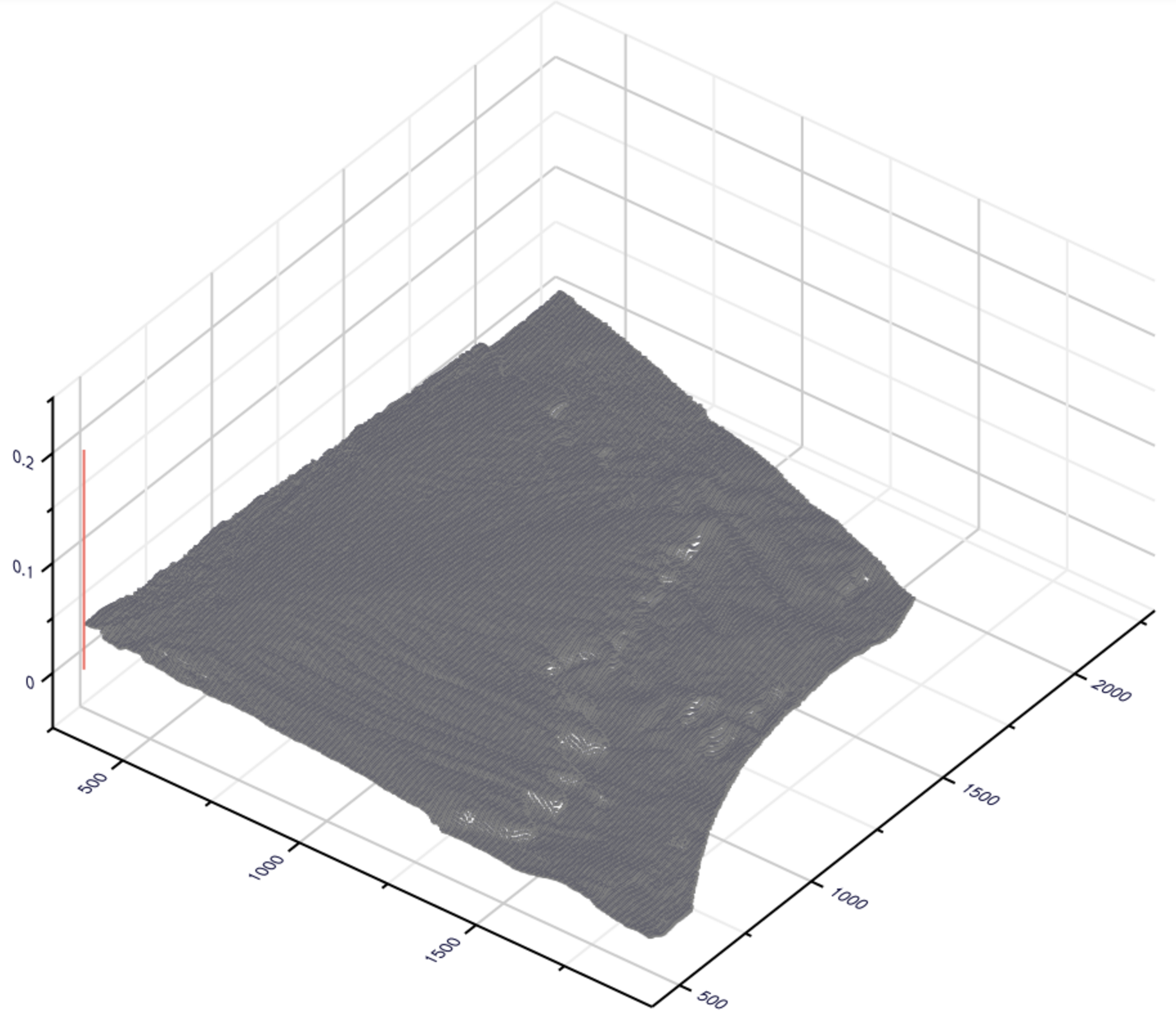
@jheinen unfortunately the grid is not regular, I tried using surfaces anyways st=:surface but the visualization didn’t improve much.
@mkborregaard I tried the markerstrokewidth=0 option, it removed some of the artifacts, but the result is still not that great with my dataset.
Perhaps I should mark this topic as solved, I will pick one of the answers, but thank you all for your help. I can proceed with PyPlot for the moment, it is not a big deal.
P.S.: How to mark the topic as solved in Discourse? Sometimes I see the checkbox near the answer and sometimes I don’t see it.
I thought you could pre-process by throwing out random points, or say every tenth? Maybe that’s helpful for speed. Do you really need to see all the points?
I’m just following this thread, scanning to here, have no need or never used the plots; maybe this idea is bad…