I’m not sure how much is reasonable to expect from GeoMakie across all the “supported” projections. For instance, is the rendering of the axes in this aeqd visualization a bug or is it just not practical for all of GeoMakie to work well across all the parameters of all the projections?
So GeoMakie works a bit differently than the rest of the projection libraries across the world. Most libraries encode the “boundary” of the projection explicitly, using some calculation. Cartopy does this, for example.
GeoMakie tries to avoid this (because in the pre-LLM era it wasn’t really feasible for one person to port all that code) by walking along the boundary of the projection to attempt to determine the bounds in projected space. Unfortunately that often leads to situations like this. The approach works most of the time, but in situations like this one you can clearly see its limitations.
The correct solution (which will hopefully come early next year, when I can get around to it) is to port all of that logic from Cartopy to GeoMakie. But for now, unfortunately this kind of stuff is going to happen. Hope to fix that soon though.
It looks like there is only one misbehaving tick so you could potentially manually override it for now by specifying the ticks explicitly?
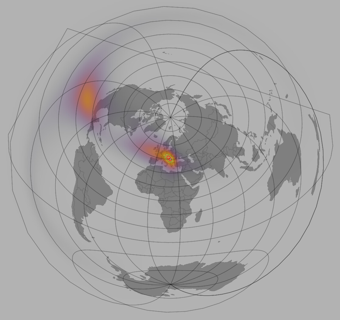
Thanks for letting me know… I’ve also been having problems with surfaces on aeqd which might be related to what I showed in my first post. However, I took care of that zeroing out the data that’s close to the antipode of lat_0, lon_0. Now I get nice results like this:

You can see a thin blue ring around the edge where I’ve zeroed the data, but it doesn’t really detract much from the visualization. The graticule just clutters this visualization, so I ended up turning it off.
That is a very cool plot!
The trick I usually use is to set values in “bad” positions to NaN. That’s transparent, so will be a bit less noticeable than the blue ring.
If you need pixel perfect plots, you could use Rasters.jl to more faithfully reproject your data into the aeqd projection before visualization - they use the same projection library underneath the hood (PROJ) and Rasters will do a much more accurate job at the reprojection (though it is a bit slower). This is only if you need “pixel perfect” accuracy though.
The problem you are (probably) having with surface ties back in to the reason that people are forced to manually define projection boundaries in the first place - projections from the sphere to the plane are discontinuous. The usual solution is exactly what you did ![]()