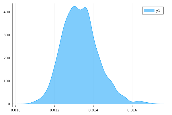
Hi, I am trying to get the density plot of a data set. I am using the StatsPlots package for this. My code looks like this density(data, fill=(0, 0.5), normalize=true). But I still don’t get a normalized plot.
I wonder what’s wrong?
I think there is a misconception on the notion of normalization. Density plots can sometimes exceed 1
Looks pretty normalized to me. It’s a density after all, which should integrate to 1.
Based on my very coarse quadrature routine this looks about right:
julia> (0.0145 - 0.012)*400
1.0000000000000002
You are right, I framed the question amiss! Actually what I want is this plot to look like a probability density function.
But it does!
Are you maybe trying to plot the probabilities to be in the finite intervals [x,x+\Delta x], [x+\Delta x,x+2\Delta x] and so on for some finite \Delta x?
In that case, fit a histogram and normalize it to probability:
import LinearAlgebra: normalize

hist = normalize(fit(Histogram, data), mode=:probability)
plot(hist)
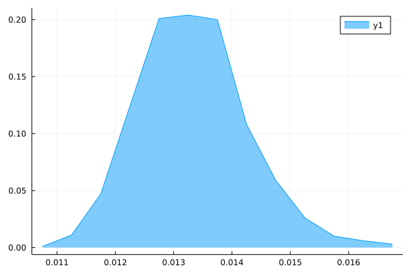
Well sort of, I just wanted my y-axis to look like probabilities, ie, less than one.
This works, although I was hoping if I could get a smooth pdf like plot, like above, and not histograms.
I tried this:
w = hist.weights
e = hist.edges[1]
x = [(e[i]+e[i+1])/2 for i in 1:length(e)-1];
plot(x, w, fill=(0,0.5))
But this doesn’t look smooth:
Why? It may superficially look like a probability, but it won’t be. What would it be normalized to? The maximum?
There is really nothing wrong with a PDF becoming larger than one. It’s expected. If that give you or your audience pause, I advise to first go and get comfortable with that. I apologize if that last sentence comes of as condescending. It is not meant to be.
Ultimately, the absolute value of a PDF isn’t very interesting. If what you want is to show the shape of the distribution, consider not putting ticks on the y-axis in the first place.
Thanks got it!