Ana
March 25, 2018, 2:34pm
1
I want to perform PCA on my data_array object.
I tried
using ManifoldLearning
using Plots

M1 = fit(PCA, data_array; maxoutdim=2)
# transforms observations data_array into PCs
Y1 = transform(M1, data_array) # 2x547
X_PCA = reconstruct(M1, Y1) # 96x547
M1_proj = projection(M1) # 96x2

Plots.scatter(M1_proj, title="PCA projection", legend=false)
but I cannot quite interpret the plot… It does not look any like standard PCA projection plots.
Any ideas?
gdkrmr
March 25, 2018, 2:39pm
2
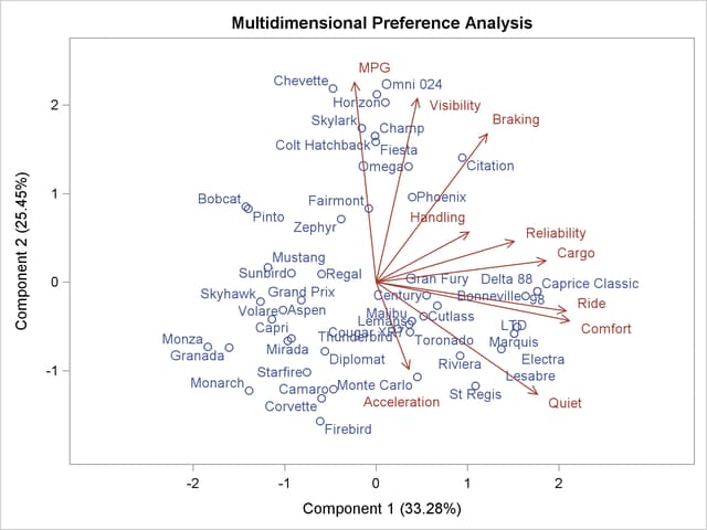
you are plotting the rotation matrix, which is usually plotted as arrows in a biplot (see here for an example), you have to plot Y1 for the actual points.
Ana
March 25, 2018, 4:02pm
3
Thanks! I just realised it is Y1. However, how can I plot the rotation matrix, or rather the new directions in the old coordinate system ?
gdkrmr
March 25, 2018, 8:16pm
4
You use the rotation matrix as coordinates for the arrow tips, all arrows start from the origin. You may have to scale them, so they fit nicely into your data.
Ana
March 26, 2018, 1:53am
5
Thanks, yes, I know. That is my question. I can’t find the right package/function.
gdkrmr
March 26, 2018, 8:09am
6
For serious plotting I still use RCall, depending on where you come from you might want to consider PyPlot too.