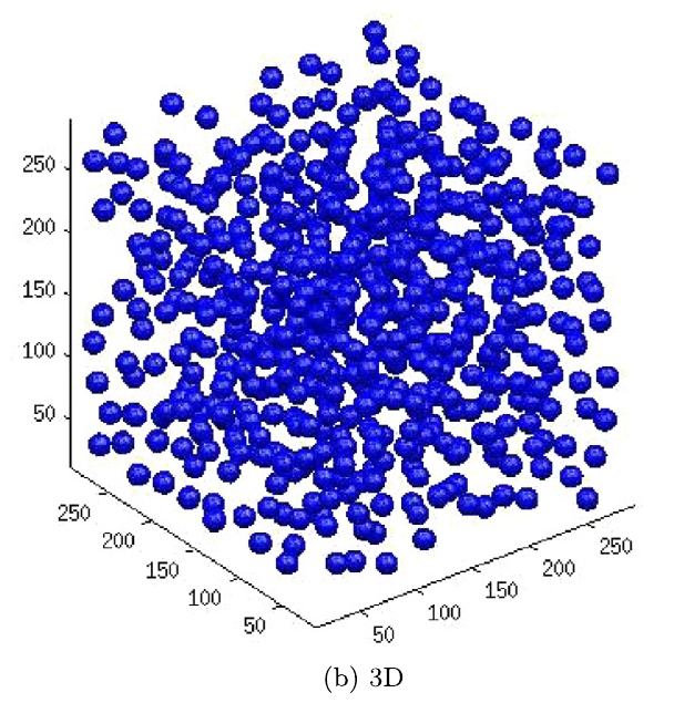
I am trying to plot my data (4 columns x,y,z,composition) which when plotted in MATLAB looks like the figure attached. I tried other opensource tools like GNUPLOT and Octave. But those show the precipitates like flat circles. I want makie to shine light so that the data points in each precipitate (blue spheres) look 3D.
I cannot help with code but as a user, the image above is very uninformative.
3D graphs are in general hard to read. Consider adding a color for the depth or better yet, try to not have a 3D graph. This comes from a person who has extensive use of surface and mesh in Matlab. In almost all cases I could plot the data differently.
Hi Boris. Visualizing precipitates in 3D is of importance in materials science. We plot the quantitative information like the average radius or the radius distribution in 2D. so we use both. naturally 2D is easier to plot.