However as a newbie I might be unable to understand how to do this. I have a GeoTable of points and I want to plot the points coloured by a column in the GeoTable.
I can do this using: Makie.viz(data.geometry, colour=data.values). However this doesn’t have equal x and y coordinates which is needed in the UTM CRS I’m using.
I can get the desired result as follows:
fig = Mke.Figure()

ax1 = Mke.Axis(fig[1, 1], aspect = Mke.DataAspect())

x = [coords(pt).x for pt in data.geometry]
y = [coords(pt).y for pt in data.geometry]

Mke.scatter!(ax1, x, y, color = data.values)

fig
However this seems very clunky for something that in R can be done (using the great sf and tmap packages):
tm_shape(data) + tm_dots(col = "values")
I imagine the nicest way to achive this would be some way to just do Mke.geoscatter!(ax1, data.geometry, color = data.values) without the need to extract the x and y values manually.
Assume a dataframe df with :geometry and :is_trauma_center, typeof IGeometry and Bool. It was read from shapefile with GeoDataTables.read()
using CairoMakie
using GeoMakie
using Geometry Basics
# Function to safely calculate centroids for polygons
function safe_centroid(geom)
try
# Try ArchGDAL centroid first
cent = ArchGDAL.centroid(geom)
return (ArchGDAL.getx(cent, 0), ArchGDAL.gety(cent, 0))
catch e
try
# Fallback: use GeoInterface to get coordinates and calculate centroid manually
coords = GeoInterface.coordinates(geom)
if !isempty(coords) && !isempty(coords[1]) && !isempty(coords[1][1])
# For polygons, use the first ring (exterior)
ring_coords = coords[1][1]
if length(ring_coords) > 0
# Calculate centroid as mean of coordinates
x_sum = sum(coord[1] for coord in ring_coords)
y_sum = sum(coord[2] for coord in ring_coords)
n = length(ring_coords)
return (x_sum/n, y_sum/n)
end
end
catch e2
println("Warning: Could not calculate centroid for geometry: $e2")
end
return (0.0, 0.0) # Fallback coordinates
end
end
# Create the figure
f = Figure(size = (1400, 1000))
# Main map for CONUS
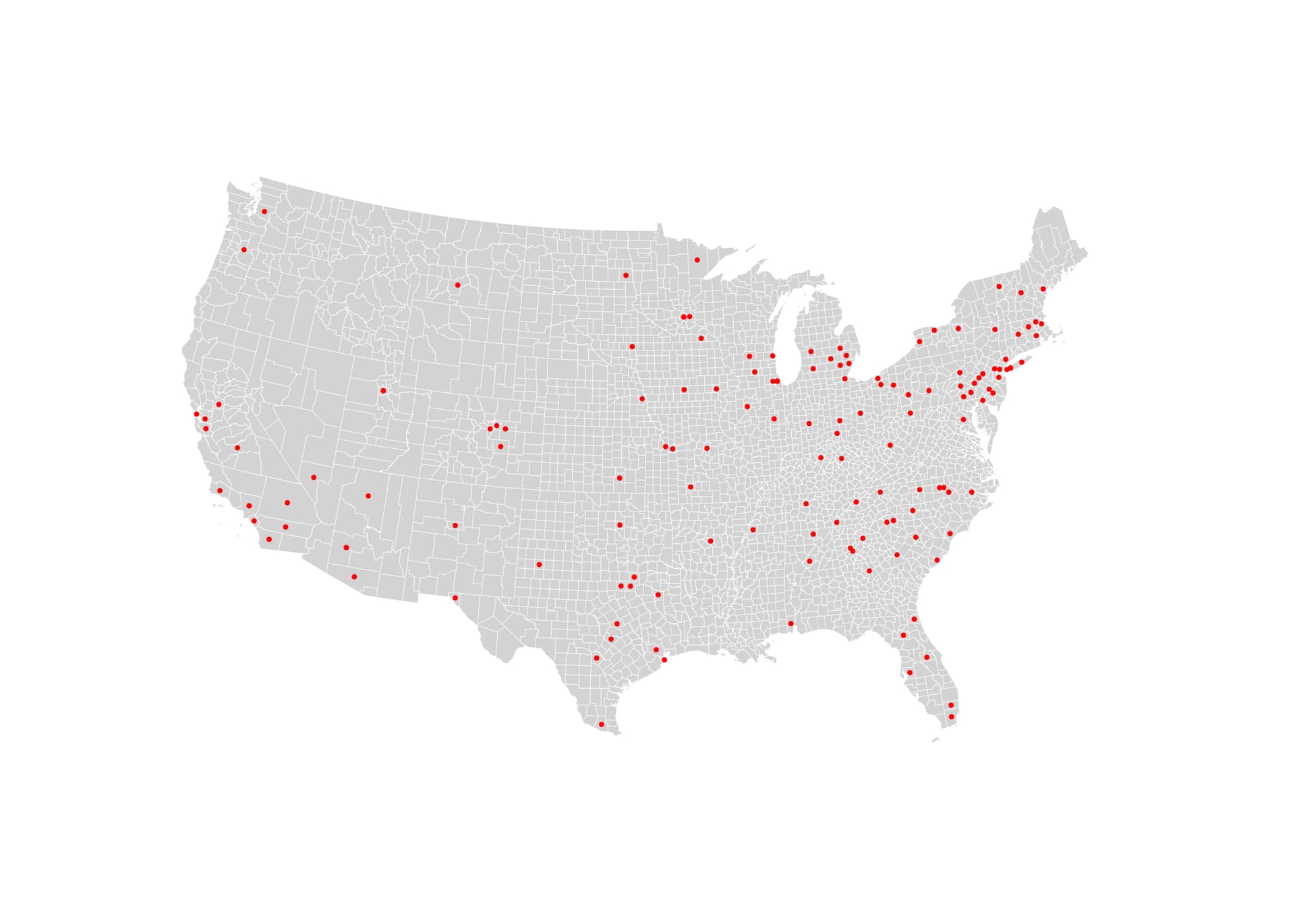
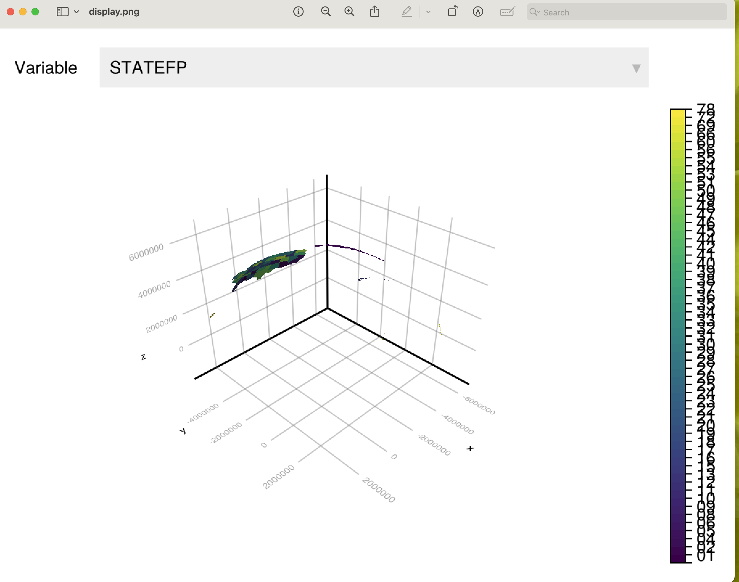
ga = GeoAxis(f[1, 1:3]; dest=conus_crs)
# Plot all counties in a neutral color (light gray)
poly!(ga, conus.geometry, color = :lightgray, strokecolor = :white, strokewidth = 0.5)
# Add dots for counties with Level 1 trauma centers
trauma_counties = subset(conus, :is_trauma_center => ByRow(x -> x === true))
if nrow(trauma_counties) > 0
# Calculate centroids for trauma center counties
trauma_centroids = [safe_centroid(geom) for geom in trauma_counties.geometry]
trauma_x = [coord[1] for coord in trauma_centroids]
trauma_y = [coord[2] for coord in trauma_centroids]
# Filter out invalid coordinates
valid_indices = [i for i in 1:length(trauma_x) if trauma_x[i] != 0.0 || trauma_y[i] != 0.0]
if !isempty(valid_indices)
valid_x = trauma_x[valid_indices]
valid_y = trauma_y[valid_indices]
# Plot dots at trauma center locations
scatter!(ga, valid_x, valid_y, color = :red, markersize = 8, marker = :circle)
end
end
hidedecorations!(ga)
Our philosophy is that you shouldn’t be forced to memorize different plotting functions to visualize the data. You just need to inform the desired geometries to the viz and it will do the job.
Also, I would simply ignore the fallacy that GeoStats.jl is heavyweight.
People don’t realize how heavyweight GDAL and ArchGDAL.jl are. And how problematic their installation can be across platforms.
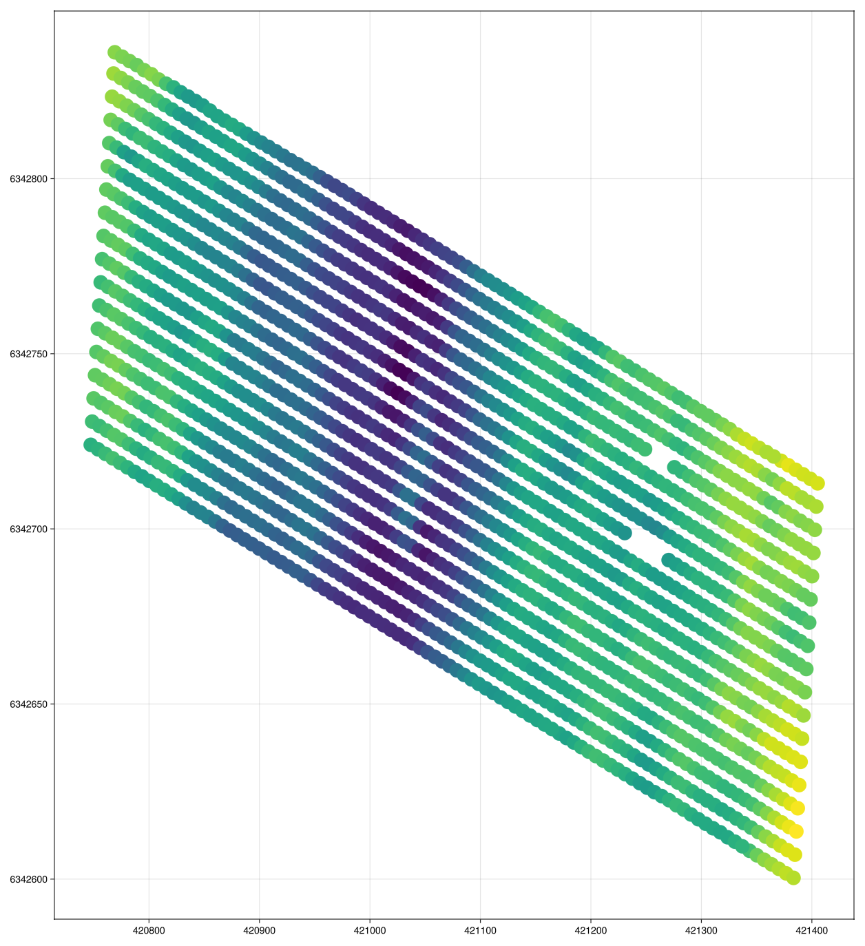
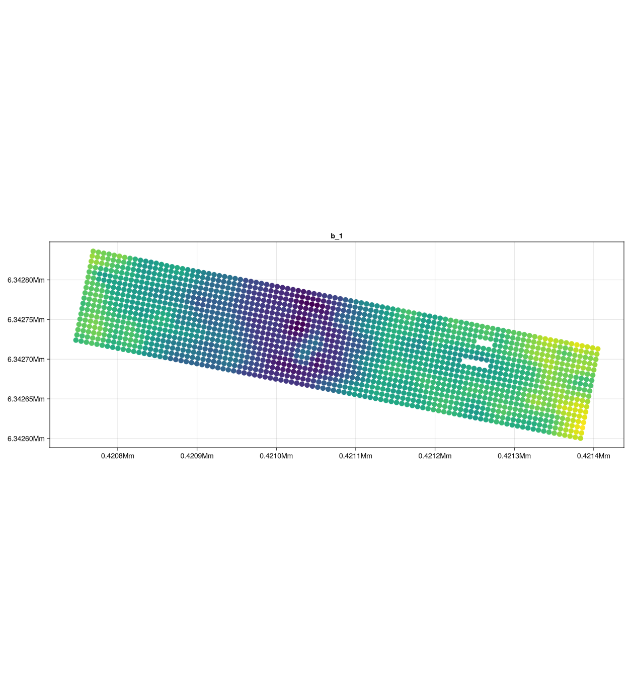
fig = Mke.Figure()

ax1 = Mke.Axis(fig[1, 1], aspect = Mke.DataAspect(), title = "b_1")

x = [coords(pt).x for pt in test.geometry]
y = [coords(pt).y for pt in test.geometry]

# for (dat, ax) in zip([test.b1, test.b2], [ax1, ax2])
for (dat, ax) in zip([test.b1], [ax1])
    Mke.scatter!(ax, x, y, color = dat, markersize = 15)
end

fig
Mke.save("test2.png", fig)
There is an additional issue regarding units: Makie.jl doesn’t have full support for unitful axis across recipes, so we strip out the units of the coordinates before calling the built-in Makie.jl recipe (e.g., scatter) under the hood. At some point in the future, when all Makie.jl recipes become more consistent units-wise, we can review viz to avoid striping units.
Think of viz and viz! as the same thing as Mke.scatter or Mke.scatter!, but more general in the sense that it recognizes the types of geometries it receives.
Highly recommend reading the chapter of the book I shared above.
Ah yeah that makes sense, and works great. Thanks a lot! I’ve read that chapter a few times but I’m still pretty ignorant with this type of plotting (spoiled by ggplot2) so thanks for the guidance.
Once again, thanks a lot for your help and patience!
I will consider improving the chapter to include examples where the axis is manually constructed and populated with viz! calls. That might be useful to future readers.
You’ve been so helpful, I’m glad I was able to talk to you about the issues I was having. Feeling great about using Julia going forward since it clearly has a fantastic community
Julio, I truly meant no disrespect. I’ve no doubt that the backend of the GeoStats ecosystems improves greatly over GDAL. I had more in mind that among all the wealth I have found much in the way of advanced techniques, but I still haven’t found the geoscience Hello, World, a simple recipe to plot a choropleth map given one of the most widespread formats in existence, shapefiles. I might wish that Makie had a recipe for IGeometry, but it requires conversion to GeometryBasic first. I’m not yet up to rolling my own Makie convert recipe to do it without the routine above. But it may come to that, may the gods protect me.
So far, the only user-lightweight workaround that I have found is a PostGIS back-end to serve WKBs. In fact, it was that which mislead me to miss the conversion from IGeometry issues earlier.
What would cause me to jump feet-first into GeoStats is a short how-to of taking shapefiles and GeoJSON, to start, plot them using vis and embellish them, a bit, in Makie.
I’m old, not to put too fine a point on it. My degrees in geology and regional planning are over 50 years old. But I’m not convinced that flat maps have seen yet their obsolescence. I think GeoStats could find a broad audience for that use case.
As an inducement, I have a book in draft Thematic Mapping with Julia aimed at a general audience of data scientists, journalists and general academic users who are assumed to have neither GIS nor programming backgrounds. My aim is to provide the minimum Julia necessary to produce high-quality thematic maps, such as choropleths. Anything that I can find to ease the learning experience on that is what I will feature.
One of the first things I did in Julia when I started as a complete novice was to make a chloropleth map. I recall the basics being pretty straightforward. I loaded shape files with geoIO, manipulated the GeoTable a bit and used Makie to plot. I had no skill, so it must have been comparatively easy!
Notice that potencial readers coming from Python and R communities have no reason whatsoever to switch to Julia for GIS work if all they get are the same old GDAL+PROJ scripts and their inherent limitations.
Your book could target a modern audience, i.e., it could promote native Julia packages that bring something new to the mapping world. Our treatment of coordinate systems and geospatial domains is quite unique across all programming languages and you might be missing an opportunity here.
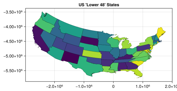
Back home now. Here is a quick MWE based on the shapefile you linked. This file includes boundaries for several areas outside the contiguous USA (eg Guam), so I’ve excluded these. The shapefile uses the ‘NAD83’ reference system, and I’ve stuck to this in the MWE.
using GeoIO
using GeoStats

import CairoMakie as Mke

gt = GeoIO.load("cb_2024_us_state_500k.shp") |> Filter(row -> row.NAME ∉ ["Alaska", "Hawaii", "Guam", "Puerto Rico", "American Samoa", "United States Virgin Islands", "Commonwealth of the Northern Mariana Islands"])

fig = Mke.Figure()
ax = Mke.Axis(fig[1, 1], title = "US 'Lower 48' States")
viz!(ax, gt.geometry, color=1:nrow(gt), segmentcolor="black", showsegments=true, segmentsize=0.3f0)
ax.aspect = Mke.DataAspect()
Mke.display(fig)
This produces a simple chloropleth map straight from the shapefile: