This is strictly speaking not a Julia question, even though I am using Julia for plotting, but I guess that a lot of people here care about scientific visualization here so it is OK.
The question is: if you are plotting multiple datasets, how and where do you label them?
Some plotting packages allow setting the legend on the plot, in which case you have to find an area that does not overlap with the data, or outside the plotting area, in which case it takes up space but requires no manual intervention.
Another option is annotating the graphics directly. This is recommended by some texts, eg Schwabish (2021), like this:
I experimented with this after reading the book above but came to finding it tedious. The above dataset is deliberately constructed so that the two lines are really close; only the colors distinguish them, so labels are close to both. When datasets coincide like this, this approach cannot be used for any other attribute other than color — eg if one line was dashed and another solid, that would be something one cannot convey with labels alone. I could draw thin connecting lines at the cost of making the plot even more crowded.
Another option is not to label at all in the plot, and leave it to the figure caption. A drawback is that if I am reusing the plots eg in slides, that information may be lost.
I am asking because I want to strike the right balance between helping the person looking at my plots, and automating plot generation to a certain extent.
My personal approach:
For exploratory plots that have to be easy to make and fully automatic – just go with a separate legend.
But for papers and especially presentations – label plot elements inline whenever feasible and looks nice.
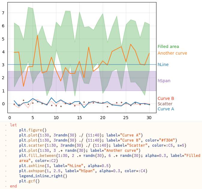
Over time, I’ve put some helper functions for inline labeling into PyPlotUtils.jl – examples from the docs:
I’ve long admired this annotation style near or beside the curve, and I agree that it’s most effective for illustrating differences. Maybe it’s useful to think of an annotated line plot as a distinct plot type?
I especially love annotated lines as an alternative to a heatmap; I find this kind of plot is much easier to interpret quantitatively compared to trying to eyeball a rainbow colorbar.
I always default to legends because they’re simple to automate and quickly convey the necessary information. And if I find that legends don’t work well for a particular plot, then that typically means that I: 1) didn’t choose my symbols/lines well and need to fix, 2) the plot needs to be simplified, or 3) it really needs to be 2 or more plots.
The typical rule of thumb from one of my advisors was: is the plot still understandable if printed in black-and-white on paper? Which is something I still try to do as much as I can.
I’ve long admired this annotation style near or beside the curve
I consider direct labeling with arrows inside the plot (@xzackli’s top example) the ultimate ideal, but hardest to automate. I often code in arrows and text labels, but need to tweak the location with manual hard coding. Not easy to automate avoidance of conflicts with nearby plot lines.
Much more reliable is labeling outside, like @aplavin shows. I kind of like this example from Mathematica, which also includes a connecting line.
The “contour label” approach can be done programmatically, like in matplotlib-label-lines. It looks okay, but you have to accept obscuring a portion of the actual lines:
I generally use legends for all my own work, since they’re so easy to do. For publication, I don’t like asking readers to do a lot of indirect addressing to match line colors or styles between legend and lines. If I expect a lot of eyeballs, I’ll take the time to hand-tweak direct labels, and if I’m feeling generous, draw my own slightly bent arrows (e.g. @xzackli).
When you ask Mathematica to do “Automatic” label placement, it seems to have some awareness of neighboring lines.
But again, to have full spatial awareness is really tough. The holy grail would be to automatically find space to put labels and bent arrows. It’s at least an order of magnitude harder than Knuth-Plass line breaking in TeX. Could be a job for AI, where vague verbal instructions like “move the green label a bit to the right”. I can imagine feeding in an example (e.g., from Schwabish) and asking it to generate code in that style.
AFAIK automatic label placement is a relatively well-explored topic already, and there are a lot of algorithms, from brute force to sophisticated. Mostly used by cartographers, you will find them in that literature. I just don’t want to get into the rabbit hole of implementing these in Julia, but if someone does, please make it generic/reusable so that all plotting libraries can benefit
That’s sensible advice. I often have a hard time with (3) though: having a single plot allows direct comparison by may be crowded. Consider eg
A = [((x, y) = (randn(), randn()); (x, y)) for _ in 1:500]
B = [((x, y) = (randn(), randn()); (x + y, y - 1)) for _ in 1:200]
C = [((x, y) = (randn(), randn()); (x - 2, y + 0.5 * x)) for _ in 1:200]
which, on the one hand, is a horrible mess and should be 3 plots with grid lines, OTOH shows where each cluster is. And of course it is another judgement call and hard to automate; divide the randn() by eg 2 and it works fine on a single plot.