Plotting 50 signals below with filled areas using PyPlot.jl takes ~0.2 s (after first plot) and allows fast interactive zoom-in:
Interactive zoom-in:

A MWE is provided herein:
using PyCall
pygui(:qt5)
using PyPlot

# Define function of some oscillatory signal:
f(t,t0) = (t>t0) ? sin(2π*20*(t - t0)) * exp(-10*(t - t0)) : 0

# Create input signal data:
t = 0:0.001:1.0
n = length(t)
Ny = 50
yyt = fill(0.0,Ny,n)
for i in 1:Ny
    yyt[i,:] = f.(t, 0.7*i/Ny)
end

# Plot signals with positive/negative areas filled:
@time begin
  for i in 1:Ny
      PyPlot.fill_between(t, yyt[i,:] .+ i, i, where=(yyt[i,:] .< 0), alpha=0.3, color="red", interpolate=true)
      PyPlot.fill_between(t, yyt[i,:] .+ i, i, where=(yyt[i,:] .>= 0), alpha=0.3, color="blue", interpolate=true)
      PyPlot.plot(t, yyt[i,:] .+ i, lw=0.4, color=:black)
      PyPlot.plt.autoscale(enable=true, tight=true)
  end
  PyPlot.tight_layout()
end  # ~ 0.20 seconds
Does anybody know if there is a better or equivalent interactive solution for this type of filled-area plots using Makie, Plots.jl or other?
Thanks in advance.
Hmm, are you after plotting seismic traces? GMT has this old segy module that I never used nor ported to GMT.jl (but it can still be used with the monolithic mode).
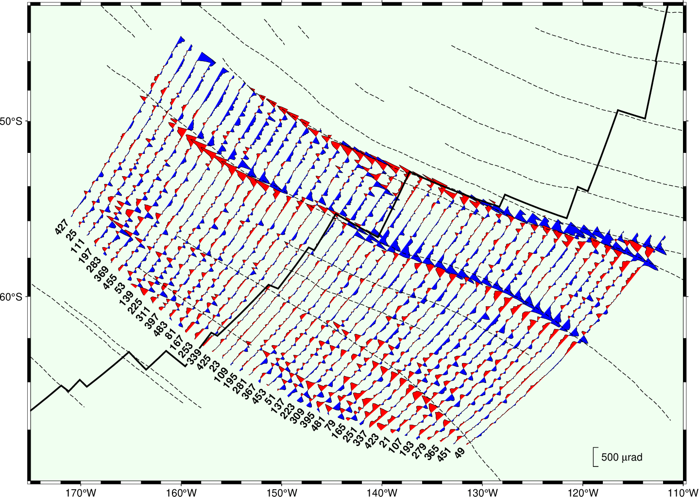
The wiggle module also seems appropriated to what you are looking for. See this image
Yes, it’s for displaying acoustic signals.
The GMT image you shared is absolutely brilliant!
As far as the “monolithic” solution goes, it doesn’t sound very interactive?
Yes, one can make very nice patterns with magnetic anomalies.
The “monolithic” mode designates the die-hard pure GMT syntax and can be used by any module. It’s actually a bit faster because it skips a lot of parsing code but the end result is exactly the same. GMT modules (almost all in the supplements) that have not yet been ported to GMT.jl can still be used in Julia using that terse syntax.
If you select the pdf output then you can zoom in a lot because figure is vectorial in origin (postscript) and that is ofc preserved in conversion.
using GLMakie
# Define function of some oscillatory signal:
f(t,t0) = (t>t0) ? sin(2π*20*(t - t0)) * exp(-10*(t - t0)) : 0

# Create input signal data:
t = 0:0.001:1.0
n = length(t)
Ny = 50
yyt = fill(0.0,Ny,n)
for i in 1:Ny
    yyt[i,:] = f.(t, 0.7*i/Ny)
end

# Plot signals with positive/negative areas filled:

@time begin
    fig = Figure(resolution=(600, 1000))
    ax = Axis(fig[1,1])
    for i in 1:Ny
        band!(ax, t, map(x-> x < 0 ? x + i : i, yyt[i,:]), i, color=("red", 0.3))
        band!(t, map(x-> x >= 0 ? x + i : i, yyt[i,:]), i, color=("blue", 0.3))
        lines!(ax, t, yyt[i,:] .+ i, linewidth=0.4, color=:black)
    end
    tightlimits!(ax)
    display(fig)
end  # ~ 0.70 seconds
It takes a surprising long time to build the plot (0.7s), but drawing is instant, so interactivity is smooth.
You can also do the 3d thingy like GMT with Makie:
Although it may be less elegant, and not very well tested (found two bugs in the limits with translation  , that must be worked around by setting the limits manually ):
fig = Figure(resolution=(1000, 1000))
ax = Axis3(fig[1,1])
ylims!(ax, 0, Ny)
for i in 1:Ny
    yyti = yyt[i,:] ./ 10
    trans = Makie.Transformation(ax.scene)
    translate!(trans, 0, i, 0)
    rotate!(trans, Vec3f0(1, 0, 0), 0.2pi)
    band!(ax, t, map(x-> x < 0 ? x : 0, yyti), 0, color=("red", 0.3), transformation=trans, transparency=true)
    band!(t, map(x-> x >= 0 ? x : 0, yyti), 0, color=("blue", 0.3), transformation=trans, transparency=true)
    lines!(ax, t, yyti, linewidth=0.4, color=:black, transformation=trans, transparency=true)
end
display(fig)
@sdanisch, thank you very much indeed for your brilliant Makie solution. This is one of the joys of Julia.
Makie output is excellent in terms of display quality and interactivity. The 3D rendering example was awesome too 
The time required to build the plot in my Win10 laptop is about 2 s, or ~10x slower than PyPlot. That is still reasonable and will mark it as a solution.
The time required to build the plot in my Win10 laptop is about 2 s, or ~10x slower than PyPlot.
We should profile why… Pretty sure that Makie should be able to be at least as fast as Pyplot for constructing the plot.
Sorry to revive an old post, but it is better than double. Is it possible to get the same figure with the axis interchanged. I mean, the signals in vertical instead of horizontal?


