# Errorbar plot with AoG
**URL:** https://discourse.julialang.org/t/errorbar-plot-with-aog/101221
**Category:** Tooling
**Tags:** plotting
**Created:** [July 5, 2023, 5:49pm UTC](https://discourse.julialang.org/t/errorbar-plot-with-aog/101221 "2023-07-05T17:49:49Z")
**Posts on this page:** 6
**Page:** 1
### Author:  [@martinmestre](https://discourse.julialang.org/u/martinmestre)
#### Post date: [July 5, 2023, 5:49pm UTC](https://discourse.julialang.org/t/errorbar-plot-with-aog/101221/1 "2023-07-05T17:49:49Z")
Hello all,
I would like to know which a way to build errobar plot in AoG. For example if I have a dataframe with columns
`r, v, dr, dv`
where dr and dv are the corresponding errors.
And also with columns
`r, v, dr, dv_up, dv_down`
for asymmetric vertical errors.
I have tried with the following:
```julia
fig = Figure(resolution = size_pt, fontsize = 37)
gridpos = fig[1, 1]
grp = dims(1) => renamer(labels) => ""
plt = data(df_models) *
mapping(:r => L"r~[\textrm{kpc}]", [2,3] .=> L"v_{\textrm{circ}}~[\textrm{km s}^{-1}]";
color = grp,
linestyle = grp
) *
visual(Lines, linewidth=lw)
f = draw!(gridpos, plt, axis=(;limits=((0,40),(0,300)),
xgridvisible=false, ygridvisible=false))
legend!(gridpos, f; tellwidth=false, halign=:center, valign=:bottom, margin=(10, 10, 10, 10), patchsize=(50,35))
ax = Axis(gridpos)
errorbars!(ax,df_Sof13.r, df_Sof13.err_v; whiskerwidth = 12)
```
but it produces two overlapping axis in the plot. I want all the curves to have the same axis.
Thank you very much in advance.
---
### Author:  [@martinmestre](https://discourse.julialang.org/u/martinmestre)
#### Post date: [July 5, 2023, 6:23pm UTC](https://discourse.julialang.org/t/errorbar-plot-with-aog/101221/2 "2023-07-05T18:23:39Z")
I did like this:
```julia
ax = f[1,1].axis
errorbars!(ax,df_Sof13.r, df_Sof13.v, df_Sof13.err_v; whiskerwidth = 12)
```
and seems fine. Is this the correct way?
---
### Author:  [@hendri54](https://discourse.julialang.org/u/hendri54)
#### Post date: [July 5, 2023, 7:02pm UTC](https://discourse.julialang.org/t/errorbar-plot-with-aog/101221/3 "2023-07-05T19:02:08Z")
I prefer the visual of `crossbar` instead of the whiskers:
```julia
errorMap = mapping(:x, :y
(:y, :yerror) => ((x,y) -> x - y),
(:y, :yerror) => ((x,y) -> x + y),
) * visual(CrossBar, color = (:gray70, 0.7));
# Colors only apply to main mapping, not to error bars.
# xyMap plots the main data (x -> y). colorMap contains the bar colors.
dataMap = xyMap * colorMap + errorMap;
# Then add mappings for layouts and bar grouping to the data and the crossbar plots:
plt = data(df) * dataMap * layoutMap * barMap;
```
---
### Author:  [@martinmestre](https://discourse.julialang.org/u/martinmestre)
#### Post date: [July 5, 2023, 7:17pm UTC](https://discourse.julialang.org/t/errorbar-plot-with-aog/101221/4 "2023-07-05T19:17:10Z")
Thank you very much! I do not know what is a crossbar but will try. Could you give me an example of `colorMap`, `layoutMap` and `barMap` ?
Is there another visual argument for whiskers?
---
### Author:  [@hendri54](https://discourse.julialang.org/u/hendri54)
#### Post date: [July 5, 2023, 7:36pm UTC](https://discourse.julialang.org/t/errorbar-plot-with-aog/101221/5 "2023-07-05T19:36:28Z")
`colorMap` is something like `mapping(color = :z)`.
Similarly, `barMap` is something like `mapping(dodge = :z)`.
And `layoutMap = mapping(layout = :z)`.
These are for grouped bar graphs. I just wanted to show how the error bars (or rather crossbars) work with grouped data.
I’m not sure what you are looking for in terms of other visuals, but you have probably seen the [gallery](https://aog.makie.org/stable/gallery/gallery/basic%20visualizations/statistical_visualizations/#Statistical-visualizations) with examples of plots that show distributional stats around y values.
The visual I am aiming for looks something like this:
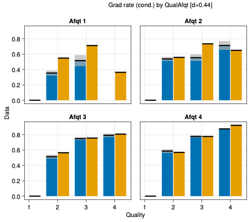
where the grey bars are the standard errors around the y values.
---
### Author:  [@martinmestre](https://discourse.julialang.org/u/martinmestre)
#### Post date: [July 5, 2023, 7:53pm UTC](https://discourse.julialang.org/t/errorbar-plot-with-aog/101221/6 "2023-07-05T19:53:17Z")
Thanks, it is good not know how to do that for the future. For the present plot I would like to draw both horizontal and vertical segments representing the errors. But haven’t found the right way to do that, regarding the visual argument I mean. Regarding the mapping you have shown me the answer:
```julia
mapping(:x, :y
(:y, :yerror) => ((x,y) -> x - y),
(:y, :yerror) => ((x,y) -> x + y),
)
```