E.g.: “Should we continue? I understand, reworking the documentation is a substantial effort, assuming “somebody” has a capacity and desire.” In my ears this implies that the documentation is so bad, that a lot of work is necessary to get it in a good state. Which is definitly not the case for AoG.
Not only that, I think it slightly hints, that this someone (i.e. the developers of the package) lack interest (desire) in doing good docs.
I have not yet AoG much, not my field, but asa far as I saw the docs, and also those of Makie, are really good.
Sure one can always improve things, here, it seems, maybe the perspective for users also new to some terminology, but I would usually see that also as a common effort that the community should contribute to as well.
So as for @Jules: Thanks for all your work!
@sfuerst @kellertuer Sorry if my previous posts came across the wrong way. And @sfuerst, thank you for being direct about how it landed.
I believed it was obvious to anyone who looked onto AoG documentation that A LOT of effort went into making documentation as good as possible.
That was actually a substantial part of my frustration: That despite extensive documentation, I couldn’t really start with the package. And yes,
- either AoG is of interest only/mostly for those producing complex statistical plots (which, as I currently see it, is probably not the case), but if it is, it is better be clearly communicated from the beginning,
- or, I believe, for a large slice of the prospective users, some rework of documentation, probably substantial one, is desirable. If in one’s ears this sound as “docs is bad” - well, sorry, it it doesn’t fulfill it’s purpose as it should, it is not good.
I intended this as a logical AND — meaning both conditions must be met. Not as “and” in the meaning of OR. Obviosly BOTH capacity (i.e. BOTH time and competence in the package) AND desire are needed to work on a package docs.
No, I questioned whether the developers have capacity in terms of spare time. Especially after the developer states:
The question was also whether other “somebodies” do exist, those having both capacity (in both aspects) and desire for a substantial rework of the docs. It was also not clear if the maintainers would consider a rework desirable - after all, many of you telling us the docs is already great.
These were sincere questions, clearly stated IMO. Now, a rhetorical question - if a statement or question comes over in a wrong way, is the problem with the statement, or with recipient? I’d say, in most cases it means the statement could be formulated better. The same with the docs.
You note the discussion mostly goes in general terms and in a not especially productive way? Which I was actually afraid of when starting the topic, but it went worse ![]()
With one notable, but apparently fast unnoted (judged by the number of likes) exception: @ericphanson made in no time a substantial PR to deal with the issues raised. @ericphanson and, again, @jules , thank you for your input here.
Now if everyone agrees the docs is already optimal, we can close the topic. Otherwise I wish we could leave it for discussions on how the docs can be improved. Thank you.
Thanks for the clarification and sorry for the detour.
I now understand (and that was not clear to me before) your intentions. So yes, we (our you others, since I do not use AoG enough) should maybe get to the more productive part of:
What and where can we help to improve the docs of AoG?
Sorry for being late to this thread, but work has been keeping me from providing earlier feedback. I am glad that some misunderstandings have been cleared up.
I did not mention any specific points in my post because I did not want to be offensive or impolite to anyone in this issue. I just felt that AoG is a very useful package within the Julia community, the docs are excellent and much better than the competition, the default colors are very nice, and the leading developers are always ready to provide help and clarification on the issues that are raised in this forum, despite no direct compensation for such efforts; notwithstanding all this kindness, there seemed to exist a deep sense of frustration with that package.
As mentioned, it’s nice to see that all potential misunderstandings have now been clarified.
I have some thoughts as to how the docs can be restructured, and there are definitely many places the docs where some information is apparently incomplete/lacking (I identified at least one more, it didn’t take much time), and also have some general thoughts.
However in the next days I have things to do in my paid job. I might continue to teach myself AoG in my spare time, but I forbade myself starting any discussions here for a while.
We’ve gone around and around with user requests that take this tone to the point where I have again stopped contributing to our own forums because people find my responses too terse and unhelpful (I don’t see it, but it’s not my place to tell other people how to feel after reading what I write). And this hasn’t been me just getting mad at entitled users—it’s usually these kinds of discussions where someone is trying to point out a problem, but we can’t understand what they’re asking or what they find confusing or get to a reproducible example. The very act of trying to clarify what the user is asking really annoys some of our users, who think they are being clear and we’re just being difficult.
You mean ggplot2 ( ggplot2 DOT tidyverse DOT org—it won’t let me post links) in R? I generally find the tidyverse documentation much better than the core of R, but that’s partly because the API design is so much better than in the core. It even hits @PetrKryslUCSD’s two classifications of documentation, though there are many useful ways to slice documentation (e.g., user-facing vs. developer facing, R vs. Python, Windows vs. Mac vs. Linux, language vs. interface documentation, executable case studies vs. manuals)
First, some general consideration.
I guess it is especially hard for developers, as the qualities required to be a good developer, and to be a good technical writer are different. In commercial settings, these roles are often separated. Unfortunately, in FOSS we mostly do not have that luxury.
On different perspectives: We all come from different backgrounds and speak different “dialects” of technical language. What seems obvious to a specialist may not be familiar to users from other fields (the “long” vs. “wide” format was just one case, I could cite a few more from this thread). The problem of different perspectives is unavoidable, but one should at least be aware of it.
The challenge is particularly acute for plotting packages because everyone does plotting, across all disciplines, with vastly different backgrounds and expectations.
Now, what can be done. IMO, one of my (my personal) problems was the Tutorial starts with a complex multidimensional dataset, right from the beginning tries to show off all the power of AoG, and to present all the powerfull underlying concepts - all of that foreign for me. My modest bandwidth was overwhelmed. Also I am not interested in penguins, and as a physicist I find a cloud of points a disgusting view.
What I may rather suggest: To start with the simplest datasets and the most simple and common plot types. My guess the most plots produced worldwide belong to these categories: Lines, Scatter, and Bar chart. In any case that is the case for experimental sciences. Thus, from my personal perspective, I think these plot types could be given disproportionally large attention.
Thus I’ve tried to draft a chapter which could in the AoG tutorial precede the more detailed “penguin-based” examples. Here it is. The examples are mine, the text mostly AI-generated. It is not a PR yet: The text may need improvements, and I have no specific idea yet how exactly it can be integrated into the current documentation: Before investing into it, I’d prefer to get your opinion first.
Can’t agree with the personal taste of penguins ![]() But I would personally love to have these additional docs, maybe as a TL; DR. At a first glance, this is quite clean.
But I would personally love to have these additional docs, maybe as a TL; DR. At a first glance, this is quite clean.
Eben,
You are correct, we all do come from different perspectives. As someone who works extensively with health data, and who previously worked with R using both the base, lattice, and occasionally ggplot libraries, the AoG home page example and tutorial seemed made with care. I first encountered the Palmer Penguins data as a package in R. I’ve seen it used frequently in illustrations of graphics libraries. A link to the explanation page on the dataset from AoG would be helpful. “The example below uses the Palmer Penguins dataset,” etc.. Perhaps jargon like tidy, which initially came from the R/ggplot world could be explained in a few lines, though the tutorial already has a detailed comparison table. A quick Google search on “long vs wide format data” presents a good AI sumary and many links to deeper explanations.
However, if you would like to speak to others coming from a physics background similar to yours and slowly build up the AoG paradigm, a blog similar to the one Bogumił Kamiński published on DataFrames might be of benefit. It is published on Github pages, source, and finished product.
Eventually, if you develop out the idea, it could be a link in the AoG documentation to ‘Other illustrations of AoG usage.’ For example, DataFrames, does something similar on its documentation landing page
I prefer the current AoG documentation. However, I’m also a fan of the Perl motto, Tim Toady or TIMTOWTDI. The more resources, especially linked with one another, the better for all comers.
I was not speaking about Physics, I was speaking about experimental sciences. In doing simulations, I was happily producing tons of heatmaps. But if you are conducting experiments, getting one data point may take minutes, hours, days, or even months. This limitation often leads to the presentation of your data as X-Y dependence, which are typically the three plot types I mentioned above.
Surely it is not about penguins, I have nothing against them ![]()
I understand surely it’s just some dataset, that could be about stars or minerals just as well. The issue is: it is a multidimensional dataset. The data complexity needs attention, thus saturating part of the bandwidth. On the other side, this data complexity is not initially needed for the explanation of the basic concepts.
No, I am definitely not going to start a blog on AoG. For many reasons. Also, note, Bogumił Kamiński is the author of DataFrames.jl
Seems that once we got off on what documentation should be, never got around to answering the questions. My preference is for wide data (one row with observations of n variables) but I showed both and also just in CairoMakie.
using AlgebraOfGraphics
using ColorSchemes
using DataFrames

# sample data
function make_y(v, n)
    m = Matrix{Float64}(undef, length(v), n)
    for i in 1:n
        e = 0.4 + i * 0.1
        m[:, i] = v .^ e
    end
    return m
end

xs = 0.0:10
m = hcat(xs, make_y(xs, 5))
nms = vcat("x", ["y$n" for n in 1:5])
df = DataFrame(m, nms)

# ============================================================================
# OPTION 1: AlgebraOfGraphics with WIDE data (using + to combine mappings)
# ============================================================================
# You can keep wide format by combining multiple mappings with +
# Each mapping gets its own color by specifying color as a string
y_cols = names(df)[2:end]
# Build layers programmatically
layers = [mapping(:x, Symbol(col), color = col) * visual(Lines) for col in y_cols]
plt_wide = data(df) * foldl(+, layers)  # or use: reduce(+, layers)
plt_wide |> draw

# Alternative: Manual combination (works if you have few variables)
plt_wide = data(df) * (
    mapping(:x, :y1, color = "y1") * visual(Lines) +
    mapping(:x, :y2, color = "y2") * visual(Lines) +
    mapping(:x, :y3, color = "y3") * visual(Lines) +
    mapping(:x, :y4, color = "y4") * visual(Lines) +
    mapping(:x, :y5, color = "y5") * visual(Lines)
)
plt_wide |> draw

# ============================================================================
# OPTION 2: AlgebraOfGraphics with LONG data (cleaner, but requires reshaping)
# ============================================================================
df_long = stack(df, names(df)[2:end], variable_name=:variable, value_name=:y)

# Basic version (uses Makie's built-in colormaps)
plt_long = data(df_long) * mapping(:x, :y, color=:variable) * visual(Lines)
plt_long |> draw

# NOTE: AlgebraOfGraphics doesn't accept ColorScheme objects directly in colormap parameter.
# See OPTION 2b below for the working solution using ColorSchemes.

# Also differentiate by line style
plt_long_styles = data(df_long) * mapping(:x, :y, color=:variable, linestyle=:variable) * visual(Lines)
plt_long_styles |> draw

# ============================================================================
# OPTION 3: CairoMakie with WIDE data (most control, no reshaping needed)
# ============================================================================
using CairoMakie

fig = Figure()
ax = Axis(fig[1, 1], xlabel="x", ylabel="y")

# Get colors from colormap
n_vars = length(y_cols)
colors = [get(colorschemes[:magma], i/(n_vars-1)) for i in 0:(n_vars-1)]

for (i, col) in enumerate(y_cols)
    lines!(ax, df.x, df[!, col], color=colors[i], label=col, linewidth=2)
end

axislegend(ax, position=:rt)
fig

# ============================================================================
# OPTION 2b: Using ColorSchemes with LONG data (WORKING SOLUTION)
# ============================================================================
# AlgebraOfGraphics doesn't accept ColorScheme objects or vectors of RGB colors
# directly in the colormap parameter. Instead, create separate layers with explicit colors.

# Get unique variables and assign colors from ColorScheme
unique_vars = unique(df_long.variable)
n_vars = length(unique_vars)
scheme = colorschemes[:magma]  # or any ColorScheme from ColorSchemes package
# Get evenly spaced colors from the scheme (i-1 to avoid division by zero when n_vars=1)
var_colors = Dict(var => get(scheme, (i-1)/(max(1, n_vars-1))) for (i, var) in enumerate(unique_vars))

# Create layers with explicit colors - this approach works!
layers_long = [
    data(filter(row -> row.variable == var, df_long)) *
    mapping(:x, :y) *
    visual(Lines, color=var_colors[var])
    for var in unique_vars
]

plt_long_colors = foldl(+, layers_long)
plt_long_colors |> draw

# ============================================================================
# SCATTERPLOT OPTIONS
# ============================================================================
# Your data is suitable for scatterplots! You have 11 points per variable.
# Scatterplots show individual points rather than connected lines.

# Scatterplot with WIDE data
plt_scatter_wide = data(df) * (
    mapping(:x, :y1, color = "y1") * visual(Scatter) +
    mapping(:x, :y2, color = "y2") * visual(Scatter) +
    mapping(:x, :y3, color = "y3") * visual(Scatter) +
    mapping(:x, :y4, color = "y4") * visual(Scatter) +
    mapping(:x, :y5, color = "y5") * visual(Scatter)
)
plt_scatter_wide |> draw

# Scatterplot with LONG data (cleaner, but requires reshaping)
plt_scatter_long = data(df_long) * mapping(:x, :y, color=:variable) * visual(Scatter)
plt_scatter_long |> draw

# Scatterplot with both color and marker style differentiation
plt_scatter_styles = data(df_long) * mapping(:x, :y, color=:variable, marker=:variable) * visual(Scatter)
plt_scatter_styles |> draw

# Combined: Lines + Scatter (shows both the trend and individual points)
plt_combined = data(df_long) * (
    mapping(:x, :y, color=:variable) * visual(Lines, alpha=0.5) +
    mapping(:x, :y, color=:variable) * visual(Scatter, markersize=8)
)
plt_combined |> draw
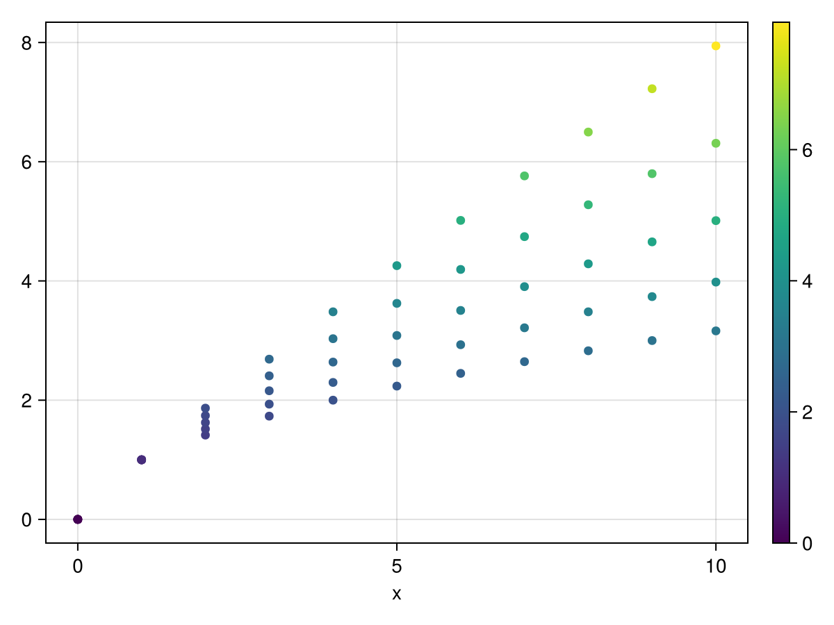
Same output for both wide and long in AOG


CairoMakie wide

Using ColorSchemes

Long


It was probably buried under the 30 posts here, but Jules answered the questions early on, I made a PR to add them to the docs, @Eben60 reviewed, Jules merged, and they are now live: Long vs Wide Data Formats | AlgebraOfGraphics. So there was a whole parallel process to actually improve the docs, somewhat decoupled from the continued discourse on improving docs ![]() .
.
It’s actually quite easy to improve docs if you have a GitHub account, as shown by Tim Holy’s 2 minute video here:

I’d encourage everyone to give it a go!
@technocrat, all the same, thank you for your examples! Seeing things done in a slightly different way is always helpful.
One small correction:
# NOTE: AlgebraOfGraphics doesn't accept ColorScheme objects directly in colormap parameter.
I suspect that might have been the case previously, but it actually does accept them now, as shown in one of Jules’ examples above.
Now I see - “double axes considered harmful”. ![]() So apparently it is just for statisticians.
So apparently it is just for statisticians.
As far as I know, statisticians do not use double axes. Only those not knowing statistics would use it.
I’m a modeller and I’ve been using AoG for several years now as my go to plotting package and published several papers (social sciences and epidemiology) which contained only or mostly AoG plots. So definitely not just for statisticians.
I have to admit I did struggle with with AoG’s approach in the beginning as well, but once I got more familiar with it I realized how much sense it actually makes and how much it simplifies plotting. I think plotting is just hard in general and every package has its own fundamental way of approaching the problem that you have to get before you can use it productively.
I agree, though, that some really basic tutorial that starts from first principles would probably be quite helpful (I liked the one that was linked here at some point).
As this thread showed again that wide data is mostly annoying to deal with because of the extra renaming of the CartesianIndex labels it requires, I had another go at improving the situation in Auto-labels for `dims` by jkrumbiegel · Pull Request #705 · MakieOrg/AlgebraOfGraphics.jl · GitHub
So once that’s merged, the example from above becomes:
df_wide = DataFrame(x = 0.0:10)
for i in 1:5
    df_wide[!, "y$i"] = df_wide.x .^ (0.4 + i * 0.1)
end

data(df_wide) * mapping(:x, ys, color = dims(1)) * visual(Lines) |> draw

@aplavin, apart from dual axes not supported, what were other limitations of AoG in your experience?